Typography Project: 24K magic
Home > Digital Design > Typography Project: 24K magic
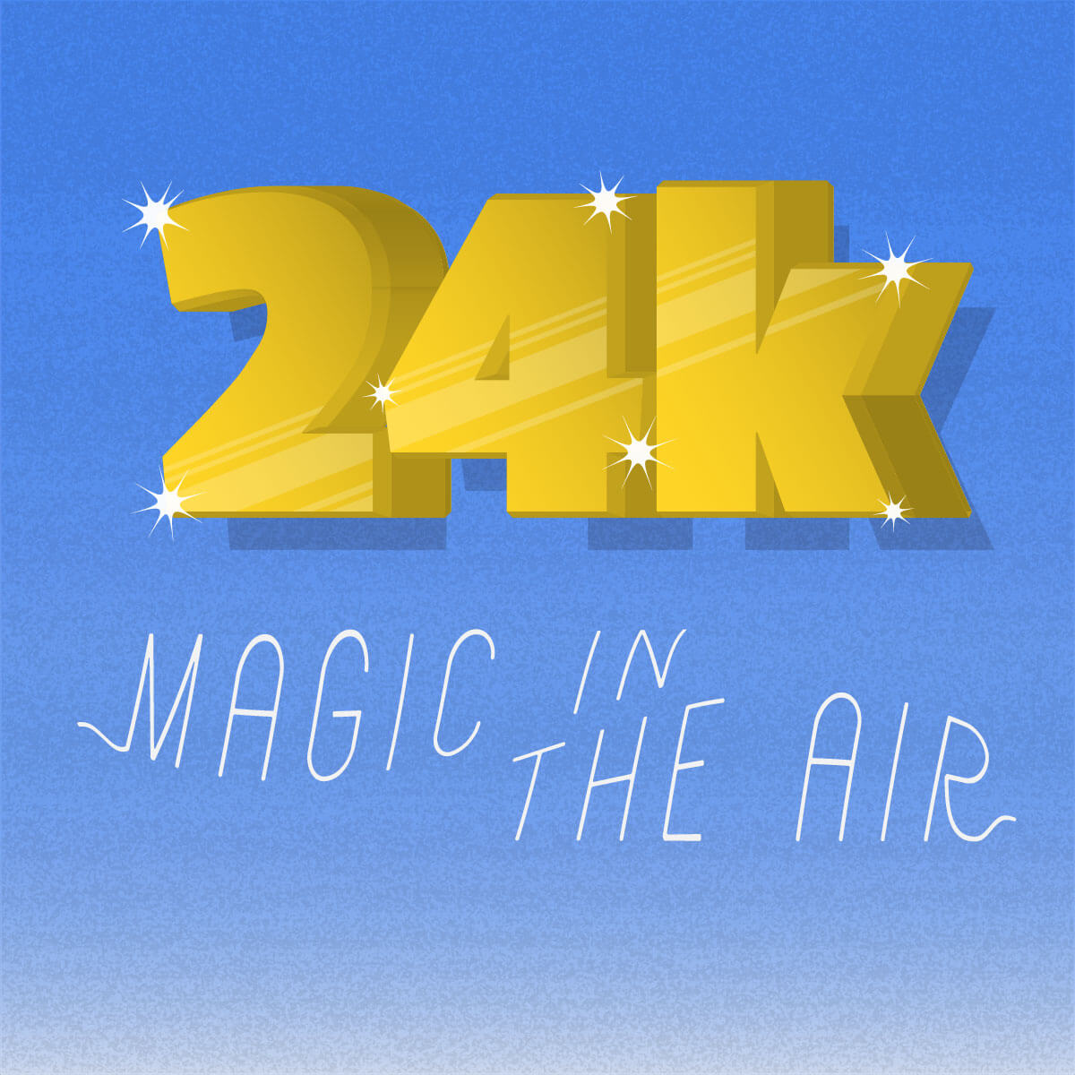
24 magic in the air
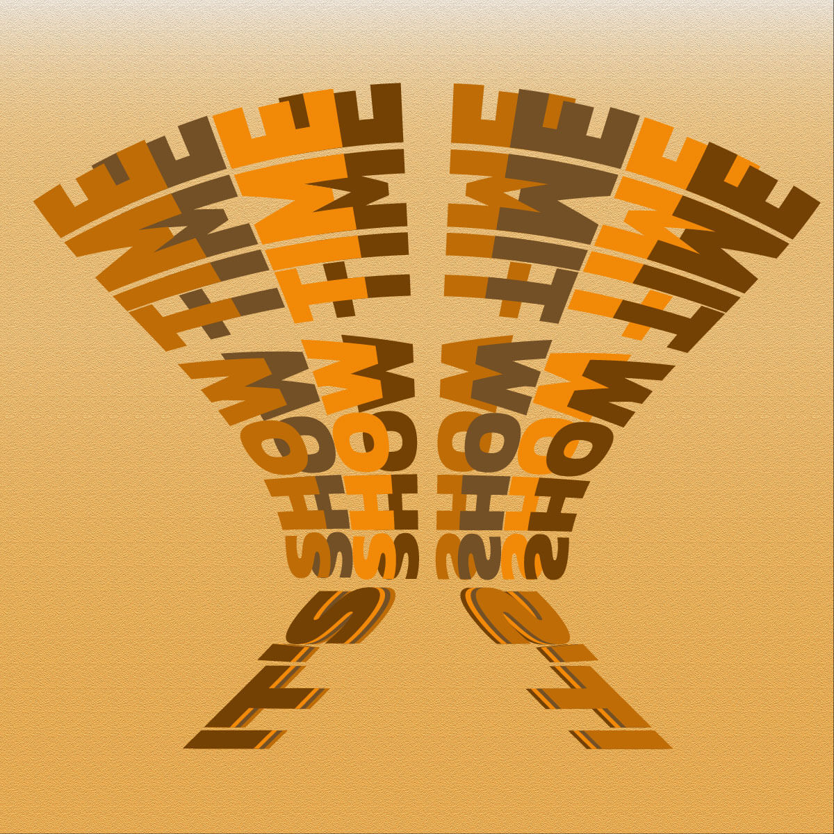
It's show time
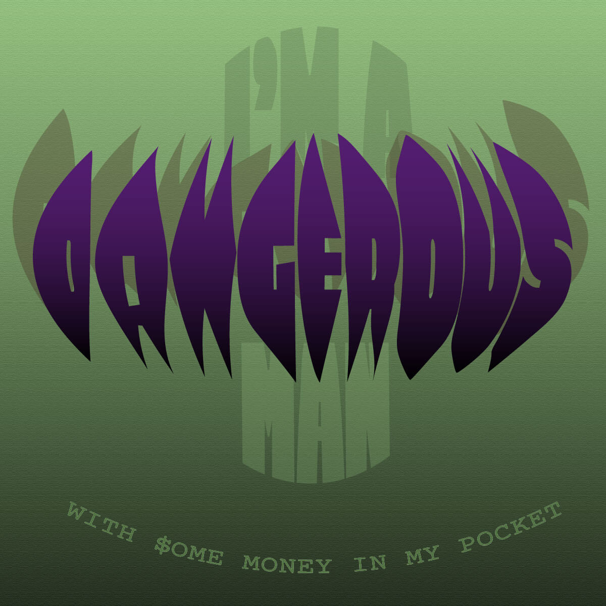
I'm a dangerous man with some money in my pocket
The project
The purpose is to create a serie of 3 images inspired from a song for a Facebook post. The artworks must be composed of typography only.
The song
24K magic from Bruno Mars (2016)
« 24k magic in the air »: This section makes me think of a flight, or something that rises. Simultaneously, the instruments, particularly the metal aspect, elicit a bling-bling side in me.
« It’s show time (show time), Show time (show time) »: We sense a boost in power, something incandescent, as a result of the fact that we are conjuring show time. The funk side and groovy rise of the tracks are similar. Because we are battered, repetition is also very crucial and accentuated by the brass.
« I’m a dangerous man with some money in my pocket »: Hearing a siren gives us a sense of danger and dread, hence this lyric is incredibly powerful. The fact that the voice is increasing gives us the idea that danger is impending and that this money guy is dangerous. A gangster (The godfather) may easily be shown here.
Research
First idea
Target:
- Male
- Medium income
- 28- 40 years old
Nostalgia from the 80's, bling bling code, electronic funky music.
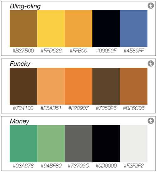
Song color:
- Grey
- Green
- Yellow
- Gold
- Orange
- Brown
- Black
- White
Bling bling: The goal is to create a bling-bling world with a gold colour scheme that shimmers and contrasts with the simplicity of the blue sky.
Funky: These hues were highly popular during this time, and were inspired by wallpapers from the 1970s.
Money: All of these tones are directly inspired by US dollar notes.
Final idea
Our target audience is mostly males between the ages of 28 and 40, because the funk universe is dominated by this demographic, as well as this age range because they are old enough to remember the funk and inspire nostalgia. Inspiration, colours, and typography will invariably elicit the emotion associated with this time period.
Typography
24K
- Passion one typo
- Display typeface: For an eccentric effect and promient
- Black font: To provide the impression of a compact gold bar
magic in the air
- Aerioz Demo typo
- Handwriting typeface: To create a fun and light atmosphere
- Regular font: Light effect that gives the impression of floating or bouncing
It's show time
- Kanit typo
- Sans Serif typeface: To achieve a clean, modern, and objective look
- ExtraBold font: To create the illusion of continuity in the light beams.
I'am a dangerous man
- Erica one typo
- Display typeface: To show an extravagant and prominent side
- Regular font: This is done to create a tense atmosphere that takes up space and suffocates the atmosphere.
with some money in my pocket
- Corrier prine typo
- Monospaced typeface: for a tech, exceptional side
- Regular font: Give a spirit that is similar to the serigraphy on banknotes.
Home > Digital Design > Typography Project: 24K magic